Semag brand identity
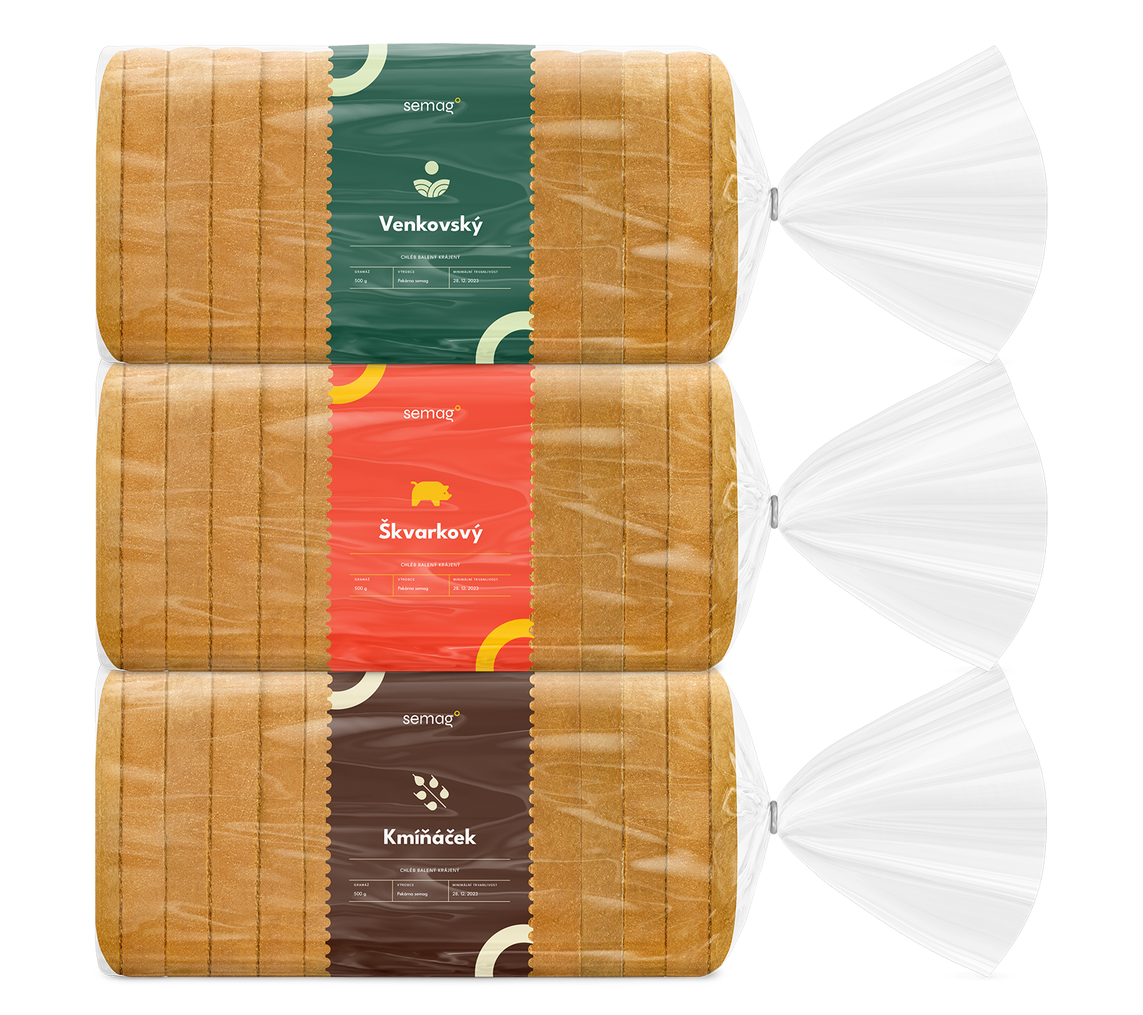
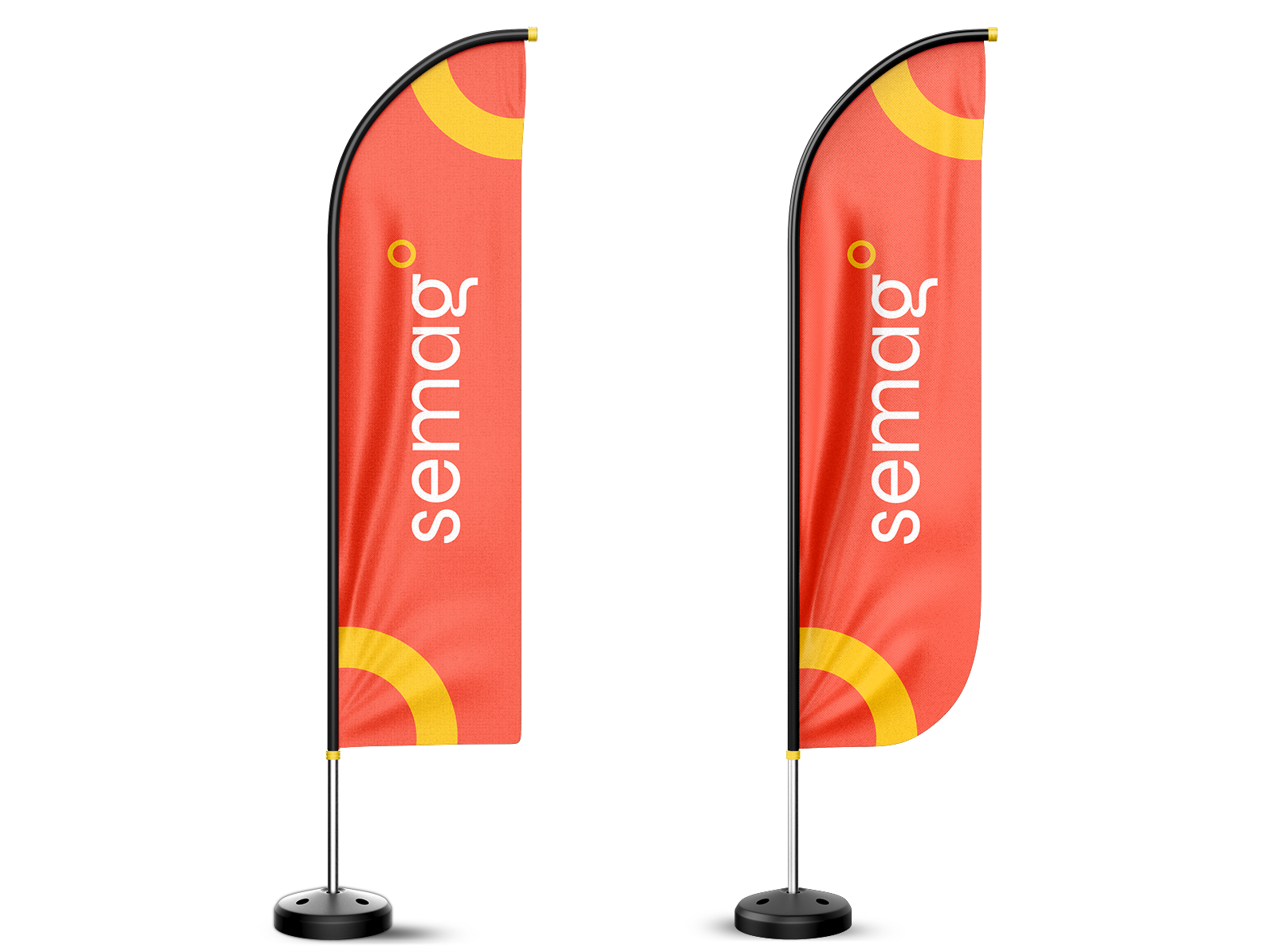
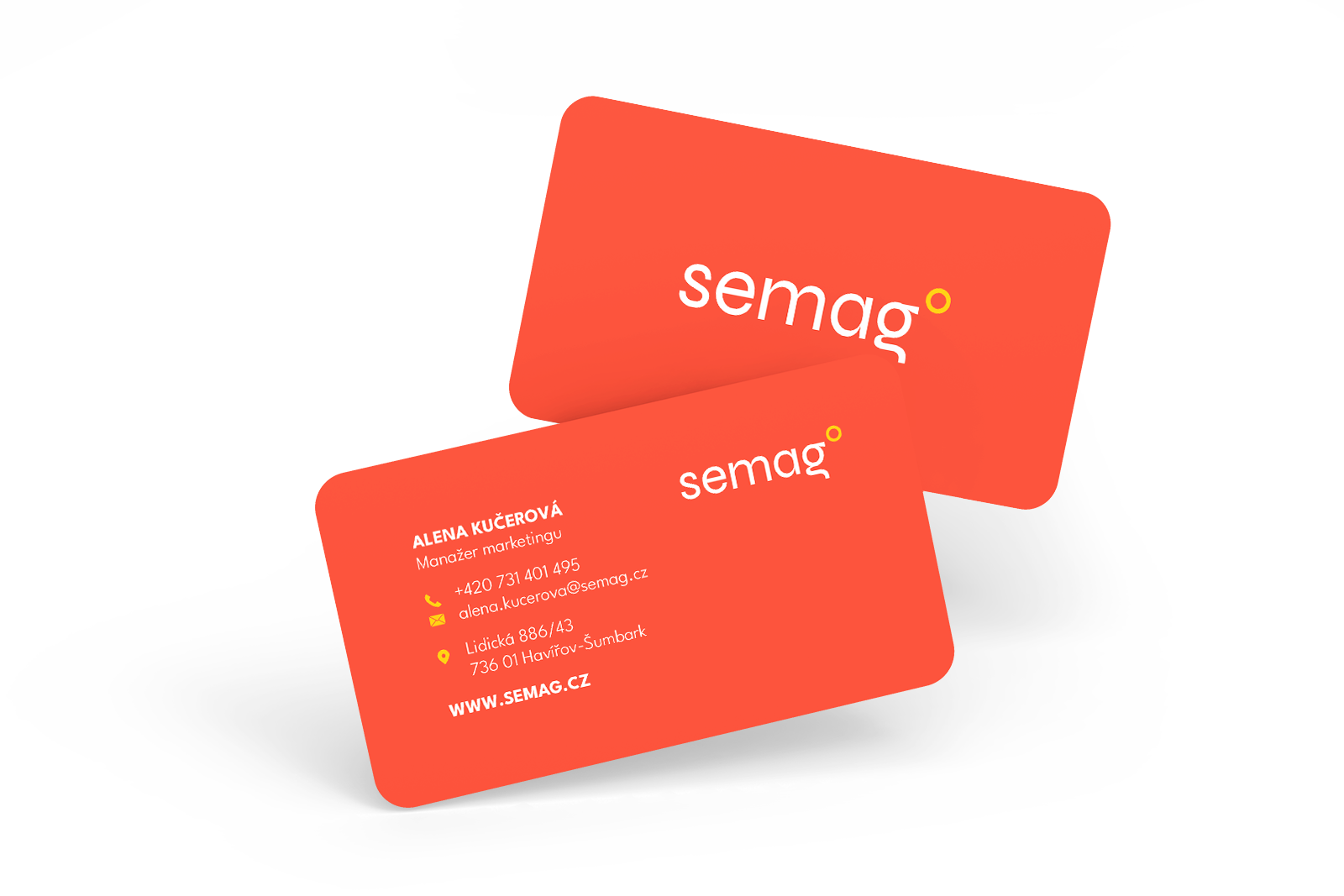
The design of the logo and comprehensive visual identity for the Semag family bakery, aimed at creating an original yet traditionally-inspired brand that reflects the values and focus of this local bakery. This concept included not only the logo design but also an approach to colors, typography, and graphic elements, all intended to convey the family tradition, quality, and friendliness. Although the design was not implemented, it was carefully developed to provide the bakery with a strong visual identity that would differentiate it in the market and appeal to a wide audience.


